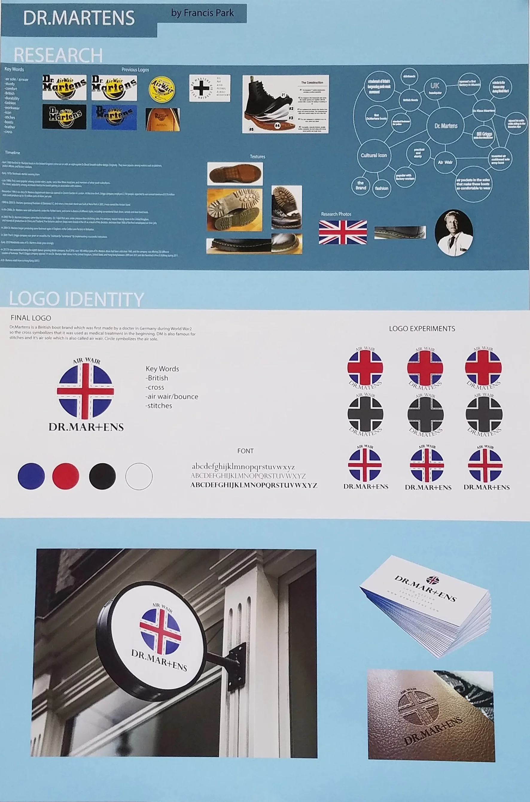
Rebranding Dr.Martens

2016
PROJECT BRIEF
The objective was to re-brand the existing company through maintenance of high quality and artistic profile.
The company I chose was Dr.Martens.
INTRODUCTION
Dr. Martens is a British footwear and clothing brand, which also makes a range of accessories – shoe care products, clothing, luggage, etc.
It’s famous for cushioned software with lightweight mid-sole.
In addition to Dr. Martens, they are also commonly known as Doctor Martens, Doc Martens, Docs or DMs.


LOGO DESIGN
Dr.Martens was first made by a doctor in Germany during the World War II. So the cross symbolizes that boots were used as medical treatments in the beginning.
The brand is famous for it’s stitches and air-sole which is also called airwair. Stitches were added around the cross and circular shape of the logo symbolizes the air-sole.
The color blue and red is used to show it’s a British brand.


Poster
Created a poster using Dr.Martens new logo and theme. White lines symbolizes the top view of the city. So lines could be the buildings and the streets/loads. Wanted to show how much people walk and how fit Dr.Marten shoes are.

Poster Animation
From top left to bottom right, it shows how the poster would be shown through animation.